London schools and challenging pupils: better outcomes than elsewhere?

Yesterday, I wrote a blog post about the rate of exclusions and suspensions from schools in London and the other regions of England of pupils eligible for Free School Meals as a part of a series about whether better funded schools were able to keep more of their pupils in schools. As promised in that post, I have also looked at the position with regard to the main ethnic, groups and a few of the less considered sub-grouping. Are London schools overfunded? | John Howson

As the following table shows, the picture for London is much more mixed with respect to the different ethnic groupings than for pupils eligible for Free School Meals.

London had the lowest rate of suspensions for five ethnic groups in the primary school sector, and four in the secondary school sector.

In respect of permanent exclusions, where rates are generally very low, and a single exclusion can affect the rate significantly, London had the lowest rate in six of the nine ethnic groups for the primary school sector and was joint equal in a seventh group. In the secondary school sector, London had the lowest rate in only two categories, but was joint lowest in another three groups- mostly were there were no permanent exclusions in this group in a number of regions, including London.

The position in special schools was somewhat different, as shown in the table.

London was not the lowest region in any ethnic grouping in ‘suspensions’ in the special school sector, and was only joint lowest in ‘permanent exclusions’. In most cases there were no permanent exclusions in these groups in any of the regions listed as ‘joint’ lowest, including in the London region. As pupils may attend some special schools from different local authorities to that where they live, and the funding for such schools is not through the  ‘School Block’ but was through the discredited ‘High Needs Block’, it is difficult to read anything into the results for the special school sector, except to say that no other region has the same level of outcome as the London region.

London schools contain a much more ethnically diverse group of pupils than schools in some other of the English regions, notably the North East and South West regions. Despite this fact, or possible because the familiarity of dealing with pupils from a wide range of different ethnic groups, often in the same classroom, and sometimes having come to school in England from war-tern or other challenging environments, have meant policies are in place to deal with situations that were less common outside the capital’s schools, London as a region still outperformed any other region in terms of being in lowest place of any region either on its own or in joint lowest position.

One can wonder: is this due to the funding being better than elsewhere? The funding formula school prevent that outcome for primary and secondary schools, if not for special schools. However, as I asked in the previous post in this series, is it the fact that funding includes a London allowance important, as the extra cash may go further if London schools employ younger, and thus cheaper teachers than in some other parts of England.

Do London schools use their cash for more classroom assistants and other staff likely to help reduce the level of suspensions and exclusions?

The data is intriguing, and worthy of more analysis than I have time to undertake. Are there also lesson to be learnt from London schools about how to reduce the number of pupils ‘kicked out’ of schools?

Finally, do academies or maintained schools exclude or suspend more pupils in different groups of pupils? What role, if any, do local authorities still play in helping keep down the levels of suspensions and exclusions? Time for me to go search the research literature.

Are London schools overfunded?

Let me be clear the answer is, of course they are not. However, as my previous post showed, there were significant differences in exclusion and suspension rates in the latest DfE data between many London boroughs and other local authorities across England. Do better funded schools exclude fewer pupils? Part 2 | John Howson with London borough having some of the lowest levels of both exclusions and suspensions.

This discrepancy between London and the rest of England, prompted me to explore the data at a regional level on two different factors: ethnicity and Free School Meals. At some point, it might be interesting to combine these two factors, but for now, they are treated as separate factors. This post deals with pupils eligible for Free School Meals. I hope, in a later post, to consider the data about ethnicity, where the are significant differences between different ethnic groups.

Firstly, here is the table for outcomes for entitle pupils for Free School Meals across primary, secondary and special school sectors.

Free School Meal – entitled pupils 2024/25 All school sectors

London stands out as the lowest rate for both exclusions and suspensions of any region in England. Permanent exclusions in the North East are more than four times higher than the rate in London, and even suspensions are more than four times higher than in the London region.

Of course, London schools may use other sanctions, such as in-school suspensions, but the differences do seem stark between the regions, with London schools using less than half the rate of suspensions of schools across any other region.    

In terms of pupils not entitled to Free School Meals, the differences between London and the rest of the regions are less stark.

Free School Meal – non-entitled pupils 2024/25 All school sectors

However, London still has a ‘suspension rate’ of less than half of that in the three regions with the highest rate of suspensions. Permanent exclusion rates for pupils not eligible for Free School Meals are generally very low across England, but, even so, London, along with the South East still had the lowest rate of permanent exclusions in 2024/25.

Free School Meal – non-entitled pupils 2024/25 Primary school sector

London doesn’t quite have the lowest permanent exclusions in the primary sector for pupils not entitled to Free School Meals: the rate in the south East is 0.01 better than in London. However, London does have the lowest rate for suspensions.

Free School Meal – entitled pupils 2024/25 Secondary school sector

Even with secondary school pupils entitled to Free School Meals, London has both the lowest rate of suspensions and of permanent exclusions o any region in England. Again, whether this is as a result other in-school measures, better staffing because of funding, or some other reasons isn’t discernible for the data.  

However, it will be interesting to consider the data for ‘ethnicity’ where London is one of the more diverse regions of England. This is because some London boroughs have low percentages of pupils on Free School Meals.

Does the funding of schools on a model of average salary funding model, with an additional London weighting in the National Funding Formula play any part in this data? For instance, does London employ more new teachers at below average salary rates.

Going forward, how will falling rolls affect the finances of schools in London and, hence, the possible rate of suspensions and exclusions in future years?

Do better funded schools exclude fewer pupils? Part 2

Earlier this week the DfE published the 2024-25 school-year data about temporary suspensions and permanent exclusions by schools. Release home – Suspensions and permanent exclusions in England – Explore education statistics – GOV.UK

The good news is contained in the headlines:

The rate of suspensions in the 2024/25 academic year was 10.88 (equivalent to 1,088 suspensions for every 10,000 pupils). This is a decrease from 11.31 in 2023/24. There were 913,000 suspensions in 2024/25, a decrease of 4% from 955,000 in 2023/24.

The rate and number of permanent exclusions also decreased from 2023/24 to 2024/25

The rate of permanent exclusions in the 2024/25 academic year was 0.12 (equivalent to 12 permanent exclusions for every 10,000 pupils). This is a decrease from 0.13 in 2023/24. There were 9,900 permanent exclusions in 2024/25, a decrease of 9% from 10,900 in 2023/24.

As the data are per 10,000 pupils, the outcomes are not affected by falling pupil rolls. However, since falling pupil numbers have yet really impacted on the secondary school sector, where most pupils are excluded or suspended, I wouldn’t have expected falling rolls to have had an impact in 2024-25.

A more interesting questions is whether funding for schools plays any part in the ability of schools to retain pupils rather than suspend or exclude them. Answering this question is slightly more complex than it might be because not all schools may behave in the same manner. for instance, Oxfordshire, a county I know well, has a higher rate of temporary suspensions, where it ranked 83 worst out of 154 local authorities in the 2024-25 data, compared with a ranking of 11th best of the 154 authorities for permanent exclusions.

However, as I have shown before, London schools are well funded compared with schools outside the capital. Thus, without a deliberate local policy to try to reduce either exclusion and suspensions, or indeed both, by schools outside the capital, it might be expected that London local authorities might rank as authorities with the lowest percentages of exclusions and suspensions.

The data for the rankings of London authorities in both 2023-24 and 2024-25 are shown in the table.

NUMBER OF LONDON BOROUGHS IN THE TOP 35 RANKED LOCAL AUTHORITIES
SCHOOL YEAR PERM EXCLUSIONS TEMP SUSPENSIONS
202324 19 27
202425 16 28

The figures for both years are impressive, with 28 of the London boroughs in the top 35 local authorities for the lowest temporary suspension per 10,000 pupils. However, this is not a new trend. In a previous post last year, I wrote the following:

As ever, I am struck by the funding issue. London, the best funded part of England has some of the lowest rates for exclusion and suspensions. There are 17 London boroughs in the list of the 25 local authorities with the lowest rate of suspensions in 2023/24, and 19 in the similar list for secondary exclusions. In the list of ten local authorities with the highest rates of exclusion are five authorities in the North East. I think that there may be something in this data that needs further exploration, especially as I would expect teacher recruitment to be easier in the North East than in London. Do better funded schools exclude fewer pupils? | John Howson

Once again, in the latest data, local authorities  in the north East fare badly, with five in the ten lowest rankings for permanent exclusions, and six in the ten lowest rankings for temporary suspensions.

Many London schools also have the benefit of Teach First in addition to their DfE funding. Even though they have to pay towards the Teach First trainees, the extra support is possibly another reason why London schools perform so well on this measure.

I wonder whether this issue is a concern to our incoming Prime Minister in view of the rankings for some local authorities in the north West of England.

Are teachers paid a fair wage for being a graduate?

Last week, the DfE published the latest report from the School Teachers Review body (STRB) School Teachers’ Review Body – THIRTY-SIXTH REPORT – 2026 This is the 36th Report from this body. Its recommendations on pay were accepted by the Secretary of State.

While the headline increases in pay, in percentage terms, seem generous, in reality they are part of a catching up exercise of a similar type to that which caused the hard-fought battle with resident doctors in the NHS.

Here’s what the STRB said about teachers’ pay over the past decade and a half:

The real-terms value of median teacher earnings has fallen since the early 2010s. The fall in real teacher pay has been greater than that for other professional occupations.

• When comparing teachers’ pay to that of other professional occupations by age and region using data from the SWC and the ONS, teachers fell below the comparators in all groups. The gaps between median teacher pay and that of other professionals was greatest in London.

• Based on proprietary benchmarking data, starting pay for teachers is between the lowest quartile and median for roles of comparable size and scope.

These three comments seem to justify the pay rise, and it is not a generous settlement in a vibrant labour market for graduates. If that market cools between now and 2027, possibly because of the effects of AI on entry level jobs, it will be interesting to see what the next STRB pay report suggests.

The STRB summed up the situation in the most recent period as follows:

In 2024-25, for the Rest of England and London, teachers’ median earnings were below those of the comparator groups for all age bands. The gaps between teachers’ earnings and those of the comparator group were greatest in London.

Across most age categories, the relative earnings of teachers deteriorated from 2014-15 to 2019-20, both in the Rest of England and London. After a slight improvement in 2020-21 during the COVID-19 pandemic, this downward trend for relative earnings continued across all age categories to 2023-24. Over the latest period, between 2023-24 and 2024-25, the relative earnings of teachers have slightly improved, although their median earnings remain below other professional occupation counterparts.

Overall, teachers aged 21 to 30 compared least favourably against the other professional occupations, both in the Rest of England and in London. Those in the oldest age group (over 60) compared most favourably, although are still behind relative earnings of those in other professional occupations. Page 70

In summery the STRB concluded that;

Our analysis of real-terms pay changes over time suggests that the competitiveness of teachers’ earnings compared to the whole economy, wider public sector and to professional occupations, was lower in 2024/25 compared to 2010/11. Figure B.10 shows how the real-terms value of teachers’ median earnings fell throughout the early 2010s. The chart shows there was some improvement for teachers between 2018/19 and 2020/21, prior to the pay pause in 2021/22, and a period of decline to 2023/24. There was some improvement in 2024/25, however we estimate that teachers’ median gross earnings in 2024/25 were 13.9% below their level in 2010/11 in real terms. Median gross earnings for the whole economy were 0.6% below their 2010/11 level, whilst median gross earnings for professional occupations were 9.2% below their 2010/11 level, in real terms. Page 71

One issue potentially facing the STRB could be the problem of a single pay scale for all teachers when the labour markets for primary and secondary school teachers are operating in very different ways. However, it would be a brave government that tackled this issue. Most likely, a move on allowances, and how they are offered, could be the obvious way to tackle over-supply in the primary school labour market, and areas of shortage in the secondary school teacher labour market.

The STRB had something to say about the axing of bursaries from some ITT subjects.

111. The number of bursaries available for 2026/27 has been reduced across a range of subjects, with others seeing a reduction in the bursary value. The bursary values for Biology and Geography are both down by 21,000, while Modern Foreign Languages and Design Technology are down by 6,000. Art, Music and Religious Education are down by 10,000 to zero, with English down by 5,000 to zero. We also note that for Business Studies, Music, Religious Education, Modern Foreign Languages and Design Technology, the reduction in bursary value coincides with the failure to reach target entrant numbers in 2025/26. P101 My emphasis

There is also an interesting table (B21) that provides evidence to support my posts over the past year querying why music and also Religious Education lost their bursaries. Pages 100 to 102, and especially table B21, where music and Religious Education were placed in the top three subjects for the lowest percentages of ITT placed filled, provide cogent evidence for the need for an explanation as to how bursaries are allocated to different subjects?

I think the STRB are sending a coded message to the DfE in this report about the lack of bursaries in some of the subjects that struggle most to recruit. The DfE’s answer, backed by HM Treasury, would no doubt be that there are few graduates in these subjects to entice into teaching, so the bursary would be paid to those already choosing teaching as a career. Funny how that argument doesn’t work for physics or mathematics.

A couple of other interesting nuggets for the STRB report:

• In 2024/25, male teachers had higher earnings overall than female teachers across all school types. Median earnings were higher in secondary schools than in primary and nursery schools.

• Based on proprietary benchmarking data, starting pay for teachers is between the lowest quartile and median for roles of comparable size and scope. …. The comparative basic salary position of leadership roles in primary schools is generally below the market base salary data, whilst roles in secondary schools are better aligned to the market base salary data.

• The full-time equivalent (FTE) teacher workforce decreased by 0.1% or 432 between 2023 and 2024. Secondary schools once again saw the largest absolute increase in teacher numbers.

• The proportion of teachers from an ethnic minority background remained stable, with 89% of teachers across state-funded schools being white. The proportion of white teachers is higher in nursery and primary schools than in secondary schools and increases with seniority in leadership roles.

Finally, a word about leadership pay. The STRB concluded that:

2.25 The comparative salary position of leadership roles in primary schools falls below the market salary data in all regions, whilst leadership roles in secondary schools are better aligned to the market salary data. P11

After a year of tracking headteacher vacancies, I do wonder why anyone would take on a job both teaching and leading a small primary school for a salary of little more than £60,000 from September when a classroom teacher with no responsibilities, and a similar length of service could be earning nearly £53,000.

Little more than £10,000 extra, for both the loss of the 1,265 working time protection and all the extra responsibilities, seems like a gross imbalance in differentials. This is especially the case when all primary leaders, and not just headteachers, work on average 5.1 hours more than classroom teachers. Table B14 page 91.

I will say more about the issue of headteachers’ pay when I publish my review of headteacher vacancies for 2025-26 at the end of August.

The saviour for the government when considering future pay is ‘falling pupil numbers’. This issue makes the need to recruit teachers, especially with the current age distribution of those teachers in employment less of an overall challenge.

However, as indicated earlier in this post, dealing with the consequences of different primary, secondary and further education labour markets may be a real issue for the next STRB Report.


Falling rolls in London: much worse than the rest of England

In my last post on this blog, I looked at the worsening of primary PTRs across much of the DfE’s ‘Inner London’ area. Falling Rolls: Is the funding formula making matters worse? | John Howson

This post looks how ‘Inner London boroughs have fare compared with the rest of England over those three years?

I think it is fair to say that London as a whole really has seen a significant downturn in primary pupil numbers. There are 22 local authorities where primary pupil numbers as published by the DfE have reduced by 5% or more between 2023/24 and 2025/26. Of these, 13 are London boroughs, and six – seven if Newham is included – are Inner London boroughs.

Seven of the top 10 places for the largest percentage decline in primary pupil numbers are filled by London boroughs. The other three places are taken by the Isle of Wight, Rutland and Torbay, three of the smallest unitary authorities in England.

Birmingham, Manchester and Leicester are the only large cities in the table. They fill three of the four bottom places for local authorities with a decline in pupil numbers of five per cent or more, along with Hillingdon in West London.

At the other end of the table, there are few London boroughs with less than a two per cent decline in their primary pupil populations.


London boroughs at this end of the table seem to be mostly outer London boroughs on the fringe of the metropolitan area. By contrast, there are seven county councils in the list of lowest declines in pupil numbers. This number increases to eight, if the Staffordshire figure, of an increase in pupil numbers, is correct.

The London boroughs will have the numbers in reception for each year, and will know how much worse the decline is likely to become over the next few years. More school closures look inevitable unless the funding model is changed to protect schools with declining rolls.

Not to protect the school estate in London is to assume that there will never be an upturn in pupil numbers. In cities, closing schools and selling off the site for housing means that in any upturn land may not be available for any new schools needed for the extra pupils. This is where thinking for the longer-term is important. During the last downturn of this size, most schools in London remained open, although some, such as Stamford Hill Infant and Junior School in Haringey, where I attended in the 1950s, did eventually close. Interestingly, the one form entry St Anne’s Church of England Primary School, close to Stamford Hill School that wasn’t actually in Stamford Hill, is still open.

However, this is not the post to discuss whether or not, in a more secular society, faith run schools should be closed where an alternative non-faith school can absorb the pupils. But this is an issue to debate, especially in urban areas.

In villages, the church-run school may still be the only school available, and that raises a much larger question about who should run state funded schooling? As the Wesleyan Methodists put it when faced by the 1902 Act, and decisions on whether to open state-funded secondary schools; are our teachers, teachers of children or teachers of Methodist children?

Falling Rolls: Is the funding formula making matters worse?

There has been a lot of discussion recently about falling school rolls in the primary school sector in London. This discussion led me to wonder whether a funding formula that is heavily weighted to a per pupil funding model might mean schools with falling rolls would have to adapt to a decrease in their income.

One possible outcome of less funding could be a worsening of pupil teacher ratios if individual support for pupils with SEND is cut, and also whole classes are amalgamated. My thesis is that Inner London boroughs might be witnessing the worst of the falling rolls problem, partly because they are boroughs with little room for new housing to be built, but also because inner cities have traditionally been the home of new arrivals to a country. Post Brexit, many European families from countries such as Poland and Romania may also have chosen to return home, taking their children with them.

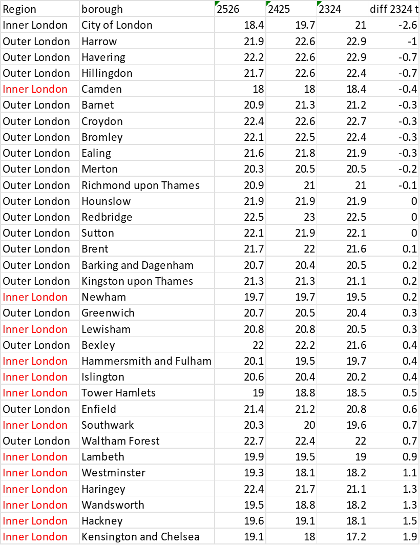
With the release last week of the school workforce data for 2025/26, by the DfE, it is possible to review the pupil teacher ratios (PTRs) for each borough for the three-year period from 2023/24 to 2025/26.

Of the boroughs in London, including the City of London, 11 boroughs improved their primary PTRs between 2023/24 and 2025/26. All but one, Camden, were Outer London boroughs. All the other Inner London boroughs recorded a worsening of their primary PTRS over the three- year period.

In the case of Kensington and Chelesea, albeit a small borough, the change was from 17.2 to 19.1 pupils per teacher over the three years: a decline of some 10%. This is a relatively large change for such a short period of time.

Seven Outer London boroughs also recorded a worsening of their primary PTRs over the same period. Of these boroughs, two, Newham and Greenwich have been classified as Inner London boroughs at sometime in the past.

Apart from the City of London, the boroughs with most improved PTRs are on the edge of London – Harrow, Havering, Hillingdon, Barnet, Croydon and Bromley.

The data in the table does suggest that falling rolls have been accompanied by a worsening of PTRs. Might this be caused in part by the construction of the National Funding formula that is heavily weighted towards a per pupil element? Reduced funding is certainly likely to impact upon class sizes and the use of teachers with small groups. Increasing class sizes and cutting individual teacher support for vulnerable learners is likely to impact upon a school’s PTR. If the reduction in pupil number sis widespread across a borough, then the impact will be seen in the PTRS for all primary schools in the borough.

I think that there is a case to be made that falling rolls are worsening PTRs for the remaining pupils across much of Inner London.

For a longer-term analysis of PTRS in London, and how over time they have been better than in most of England see  (1) (PDF) PTRS OVER TIME: A REVIEW OF PUPIL TEACHER RATIOS BETWEEN 1974 AND 2024 AND TWO PERIODS OF LOCAL GOVERNMENT RE-ORGANISATION PTRS OVER TIME: A REVIEW OF PUPIL TEACHER RATIOS

Demand for music teachers: where were the jobs in early 2026?

This post follows on from my previous post, written yesterday, and looks in more detail at the vacancies for music teachers tracked since January 1st 2026. Music teachers: labour market update | John Howson

Due to further data cleansing, the numbers may slightly differ from yesterday in some respects after mis-allocations in certain fields have been corrected.

Vacancies are generally either for a main scale/Upper Pay Spine post or for a promoted post.

In terms of the ratio of promoted posts with a TLR, or in a few cases a Leadership Scale offer, to posts without any additional allowance, the East Midlands region tops the list at 37% of advertised posts with a TLR.  At the other end of the scale, no promoted posts have been recorded for the North East. It may be that schools in the North East use regional job boards for promoted posts. Those boards are currently out of scope of my survey.

The East of England region also had a lower-than-average percentage of promoted posts in the total of advertised vacancies. However, this may be partly due to the larger than average number of posts advertised without any additional pay supplement dragging down the percentage of promoted posts.

Most promoted post are TLRs advertised as a 2b.

In terms of the need to re-advertise vacancies for teachers of music, there are three clear regional groups: the East Midland and East of England with well above average levels of schools re-advertising; Yorkshire and The Humber region where, to date, no re-advertisements have been recorded, along with the West Midlands, North East and South West, regions with well below average levels of re-advertisements.

The remaining regions have re-advertisement rates broadly in line with the national average. Of course, there is still time for other schools to re-advertise before the end of the summer term. However, as they would only be attracting ITT completers or returners, this might be something of a futile exercise, only worthwhile if at no cost, such as using the DfE vacancy website.

Interesting questions that arise from the data are: how well does ITT provision map with demand and are there any characteristics of schools that re-advertise vacancies – high free school meal percentages; excellent music departments; high-cost housing areas; long distance from ITT provision no recent history of schools being used by trainees?

Other interesting questions to research include: the balance of full-time versus part-time vacancies and between permanent and temporary vacancies; and how many of the latter are as a result of a teacher taking maternity leave? Fortunately this data has been collected along with whether or not the school is an academy and if the post is eligible for visa sponsorship: most are not.

If I have the time, I will try and address some of these questions in the round-up after the end of the summer term in August. Meantime, any views would be welcome in the comments section.

NEETS: Why is London so different to the rest of England?

London seems to be a different world to much of the rest of England when it comes to looking at a range of different indicators about education. The latest one where the statistics raise an interesting question is the percentage of 16- and 17-year-olds that are NEETs (Not in Education, Employment or Training).

With the raising of the suggested ‘learning leaving age’ to eighteen (the official age is still sixteen) it is expected that almost all students in what is Years 12 and 13 should be in some form of certified education or training. The DfE asks local authorities for data each year bout the percentage participating in education or training and produces scorecards on-line. I wonder how many local authority scrutiny committees ever see this data? Participation in education, training and NEET age 16 to 17 by local authority, Academic year 2024/25 – Explore education statistics – GOV.UK

The scorecard for Oxfordshire can be found at Oxfordshire_neet_comparator_scorecard.pdf

Looking through the data for all local authorities for both 2019 and 2025 what struck we was there was a definite London effect. 28 London boroughs had higher participation rates in 2025 than in 2019. For the rest of England there were only 37 other local authorities with higher participation rates in 2025 than in 2019.

One explanation is the inclusion of ‘no data’ in the NEETs percentage. As the DfE noted;

 ‘NEET/not known rates at the end of 2024/start of 2025 ranged from 0.0% City of London to 21.5% in Dudley. Dudley’s rate includes 2.4% NEET and 19.1% activity not known.’

So, either London boroughs are better at collecting the data – quite possible, given their relatively small size and close geographical cohesion, or there is something else going on.

On the other hand, only seven ‘shire counties’ had higher participation rates in 2025 than in 2019.  Might the decimation of rural bus services and the effect of a punitive motor tax on those without a no claims bonus be something to do with this change? Could it be that in large counties there are no longer the staff to badger multi-academy trusts (MATs) to provide accurate data about the destination of Year 11 leavers?

I think the DfE data should make clear both the known percentage of NEETs and the percentage of the age group where these is no data available. Perhaps, there might be a scorecard of MATs to identify those that provide high quality data, and those where hard pressed local authorities have to waste time and money chasing the data.

With the job market looking increasingly challenging over the next few years, and fewer incentives for employers to offer jobs with training to school leavers, the percentage of NEETs is an issue that needs more visibility, especially with the rapid growth in EHCPs. Will the significant increase in young people with mental health issues result in more NEETs, and if so, will London be different?

Sutton Trust and the London effect

The recent publication of  an Opportunity Index Interactive Map – The Sutton Trust by the Sutton Trust raises some interesting questions about both methodology and the funding of schools.

I am in the process of completing an article discussing changes in pupil teacher ratios in England over the past 50 years between period of local government re-organisation. What struck me in doing that research was how often London boroughs had the most favourable PTRs, both in the late 1970s, and fifty years later in the 2020s.

Now, the Sutton Trust uses constituencies not borough in their mapping, but there is the same result: London parliamentary constituencies in the 2024 general election fill the top 20 places in a number of the Sutton Trust rankings, including the attainment 8 score for pupils with Free School Meals – not sure whether that is entitlement or take up, as they can be different in the secondary sector.

The Sutton Trust map illustrates the high rankings for much of London and parts of the Home Counties to the north and west of London. I am sure that the f40 Group of Local authorities will find this a useful tool to show how badly rural areas are funded, with many rural constituencies falling into the lowest toe categories of ‘very low’ and ‘low’.

Someone might also want to look at rural areas where there are selective secondary schools. I was struck by the fact that Weald of Kent constituency, where I stood in the 2024 general election for the Liberal Democrats, ranked 526th out of 533 constituencies in the Opportunity Index listing. Pupils in the constituency are in the Kent selective school system, and most don’t qualify for free transport to a selective school, even if they pass the entry test. Does that make a difference?

Looking at pupils that grew up in Oxfordshire, there are large differences. in the rankings in the Opportunity Index, with Bicester & Woodstock constituency ranked 68th in the opportunity rankings, and Oxford East some 398 places lower,  with a ranking of 466 out of the 533 constituencies.

ConstituencyRank out of 533Top 50% earners by age 28Top 20% of earners by 28Attainment 8 for Free School Meals Pupils
Banbury41037729
Bicester & Woodstock68431236
Didcot & Wantage260361231
Henley & Thame211461632
Oxford East466351029
Oxford West & Abingdon259401235
Witney324431027

This disparity helps to make the point I have made before, that the present funding formula for schools doesn’t work for pockets of deprivation in relatively affluent upper tier authorities. This has been the message of the f40 Group for some considerable time, and is supported by my study of PTRs across the past 50 years.

The last paragraph is not to deny the fact that urban constituencies in the metropolitan areas take up many of the lowest ranking positions, but it is worth looking at those constituencies that are near the bottom of the rankings, such as Clacton and Weald of Kent, and that don’t fit the normal perception of areas where opportunities are mor limited than in other constituencies.

Tis it once again time to discuss again how we fund our schools, and what society wants its schooling system to try to achieve.

More jobs: lower employment outcomes

The data provided by the DfE in the teacher profiles is very much at the headline level and has made direct comparisons with previous year more of a challenge except where the DfE has recalculated the data for earlier years. This blog looks at employment percentages by ethnic group and region of training.

The change in methodology introduced by the DfE in calculating completion rates for postgraduate students in ITT in 2021/22 has made a difference to the percentages of each ethnic grouping employed in state-funded schools. For comments on last year’s data under the previous methodology please see Disturbing profile data on new teachers | John Howson (wordpress.com)

For the latest DfE profiles see Initial teacher training performance profiles, Academic year 2021/22 – Explore education statistics – GOV.UK (explore-education-statistics.service.gov.uk)

Although the difference between the groups is smaller than under the previous methodology, there are still differences. The most notable is between the Asian Group and the White and Black groups; a difference of some 7% points.

Postgraduate trainee qualified teacher status and employment outcomes by ethnic group

Group2017/182018/192019/202020/212021/22
Total80%78%74%73%75%
Asian78%73%67%64%69%
Black82%81%74%71%76%
Mixed82%81%74%71%76%
Other79%75%65%66%71%
White81%78%74%74%76%
Unknown78%86%80%76%80%
Initial teacher training performance profiles

The ‘unknown’ grouping is the only one where under the new methodology the 2021/22 percentage is higher than the percentage in 2017/18. The increase for this grouping may be down to the larger numbers in the latest survey recorded as ‘unknown’.

Again, the lack of a breakdown between primary trainees, where trainees may have found that  jobs were more difficult to come by, and secondary sector trainees, where in most subjects the jobs advertised exceeded trainee numbers, makes it difficult to say much more about the overall outcomes for the sector. However, a percentage of the increases in employment percentages between 2020/21 and 2021/22 can be put down to the larger increase in secondary teacher vacancies between the two years.

There is little difference in employment outcomes for other groups, with women having a slightly higher percentage employed in state-funded schools than men, and older trainees a slightly high percentage than younger trainees.

Postgraduate trainee outcomes by region for the 2021/22 academic year

Total traineesPercentage awarded QTSPercentage of those awarded QTS teaching in a state-funded school
England31,74793%75%
North East1,26187%66%
North West4,84093%64%
Yorkshire and The Humber3,35890%72%
East Midlands2,13492%78%
West Midlands3,34693%73%
East of England2,53194%85%
London7,31994%81%
South East4,57494%78%
South West2,38493%77%
Initial teacher training performance profiles

London and the Home Counties were the regions where the highest percentages of those awarded QTS were likely to be employed in a state-funded school. This is despite the fact that these areas also contain the largest percentage of private schools.

Some of the rationale for reducing trainee numbers in the north of England is obvious from the employment outcomes. Assuming that trainees wish to join the state sector, the fact that only two thirds of those with QTS in both the North East and North West regions were in employment does suggest that there was a question about the distribution of places across the country. The reduction of places in the South West after the recent review, and especially in Devon, does seem harder to explain from just the employment statics alone.